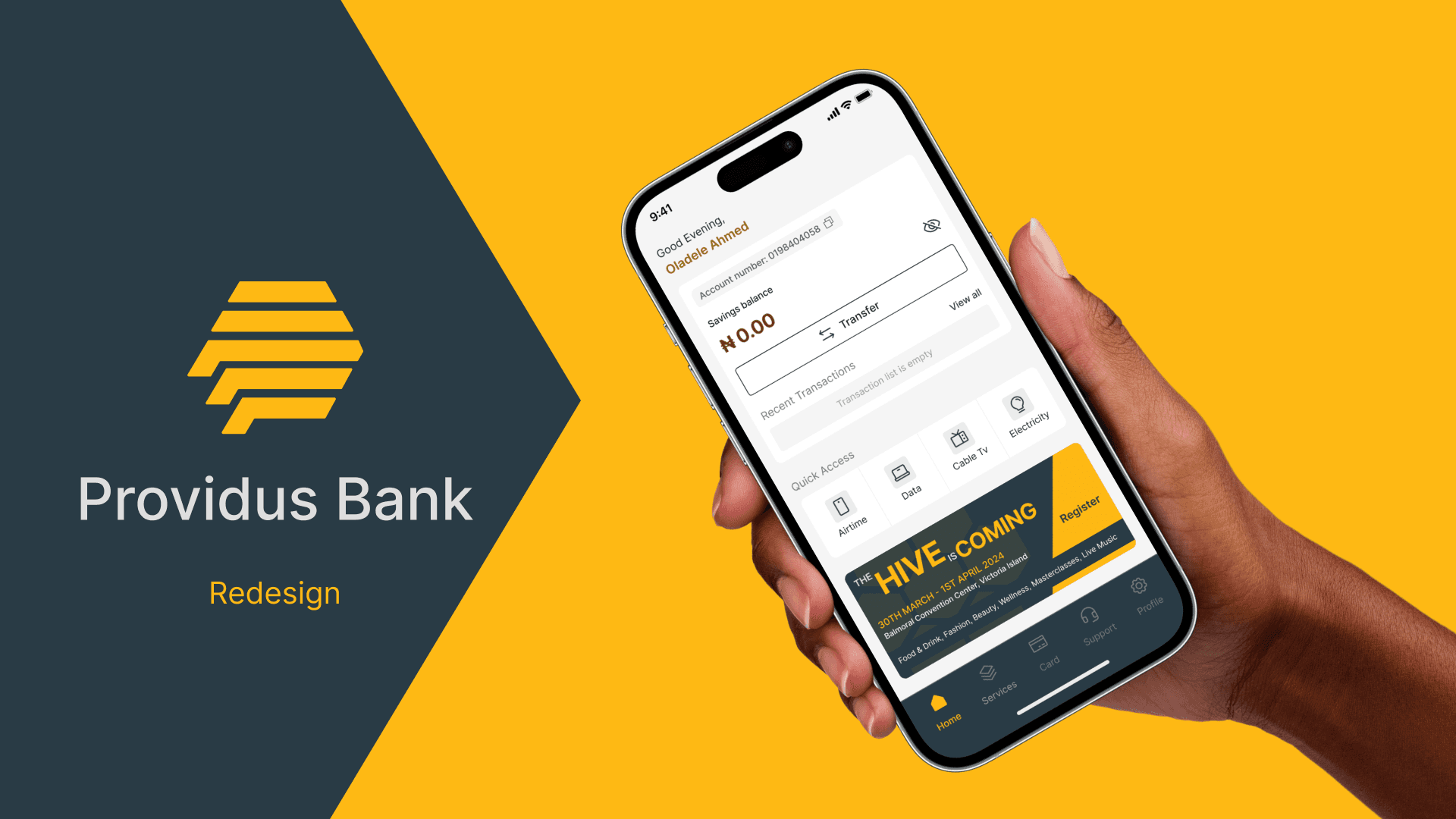
About
Providus Bank is a Nigerian commercial bank known for its premium banking services tailored to businesses and individuals. As a designer passionate about creating seamless digital experiences, I chose to redesign Providus Bank’s mobile app to address user experience challenges and visual inconsistencies I identified in their existing product. This redesign was a self-initiated project aimed at improving usability, enhancing visual appeal, and creating an interface that reflects the bank’s premium positioning while making everyday banking tasks more intuitive and enjoyable for users.
CHALLENGE
The existing app felt outdated, cluttered, and unintuitive. Users struggled with complex navigation, unclear service layouts, and a lack of visual consistency across screens. The biggest challenges I aimed to solve included:
Creating a clean, modern, and trustworthy interface aligned with Providus Bank’s brand image
Improving information hierarchy to make banking features easy to find and use
Simplifying workflows such as bulk transfers and service payments, which often felt overwhelming for users
Designing an experience that feels premium, seamless, and welcoming


Design Approach
My design approach focused on clarity, simplicity, and brand alignment. I started by analysing the current user flows, identifying points of friction and opportunities for improvement. I then restructured the navigation to prioritise the most-used services, created clean layouts with ample spacing, and introduced a cohesive visual system based on Providus Bank’s brand colours and identity.
The visual direction emphasises a modern banking experience with minimal distractions, strong typographic hierarchy, and intuitive iconography to guide users effortlessly through tasks.
The Solution
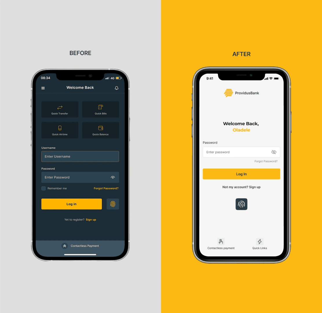
Login Screen
The new login screen features a simplified, secure interface with clear CTAs, a prominent brand mark, and accessible colour contrasts. Users are welcomed with a clean, premium feel that builds trust from the first interaction.
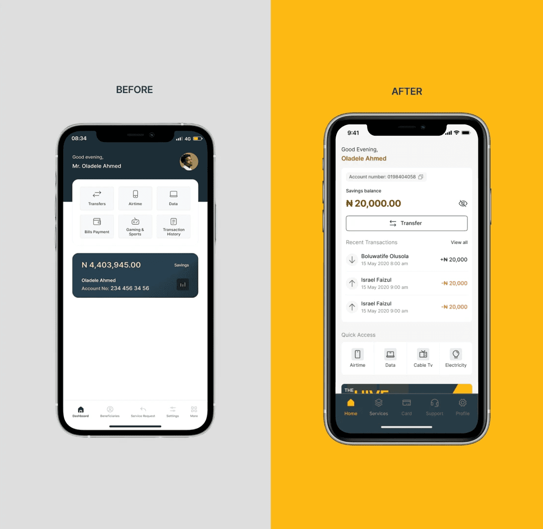
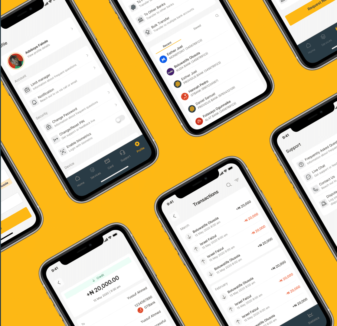
Home Screen
The redesigned home screen provides a clear overview of account balances, quick actions, and recent transactions. It prioritises user needs by placing essential features upfront, reducing navigation time and enhancing efficiency.
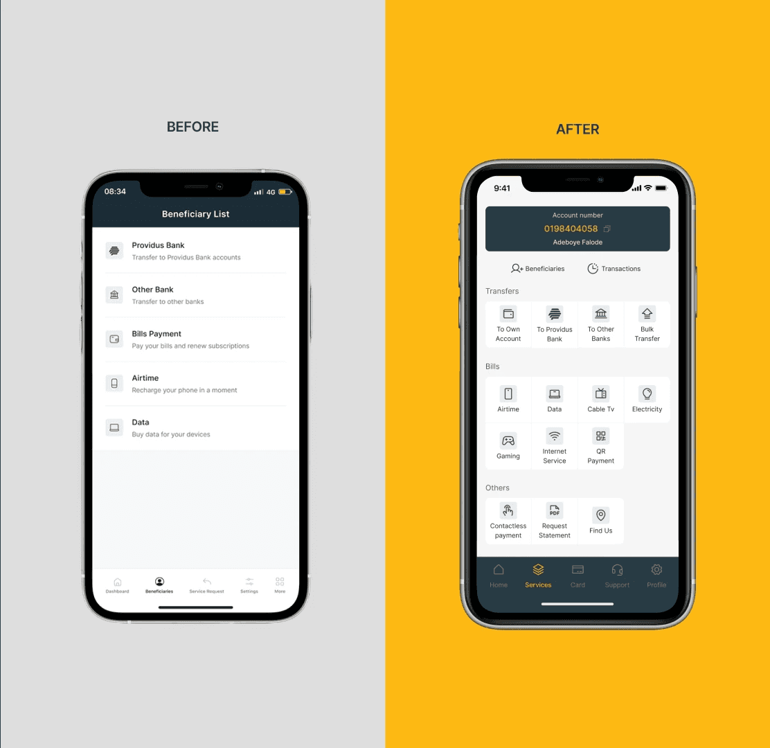
Services
The services section was redesigned to be more intuitive, with well-defined categories and clear icons, allowing users to locate and access services seamlessly without confusion or overwhelming text blocks.
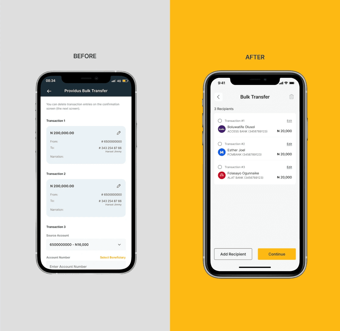
Bulk Transfers
Bulk transfer workflows were simplified with a guided, step-by-step process, clear instructions, and status confirmations. This ensures users feel confident completing bulk transactions, which are critical for business customers.
Additional Improvements
I also introduced consistent spacing, refined typography for readability, and modernised the colour palette to enhance accessibility. Interactive elements were made more prominent, and micro-interactions were considered to improve feedback and delight throughout the experience.
Reflection & Learnings
This redesign deepened my understanding of how to transform complex banking interfaces into simple, confident, and premium experiences. It reinforced the importance of aligning digital products with brand positioning while prioritising user clarity and efficiency.
Working on Providus Bank’s redesign challenged me to think critically about balancing usability with aesthetics, ensuring that visual improvements directly support functional enhancements for real user needs.