About
Eatery is a platform designed to streamline restaurant management and dining experiences. It facilitates reservations, orders, and operational workflows with precision, efficiency, and a modern touch. The branding needed to reflect Eatery’s core values of connection, precision, and modernity while remaining approachable and versatile for the diverse food service industry.
CHALLENGE
The primary challenge was designing a brand identity that felt warm and human-centric while communicating technological efficiency. The symbol had to represent dining clearly without relying on clichéd food icons, and the typography needed to complement the symbol with a clean, professional feel suitable for digital and physical applications.
Additionally, the visual identity needed to balance realism and versatility, ensuring it could adapt seamlessly across app interfaces, signage, marketing materials, and digital platforms without losing recognition or impact.
Design Approach
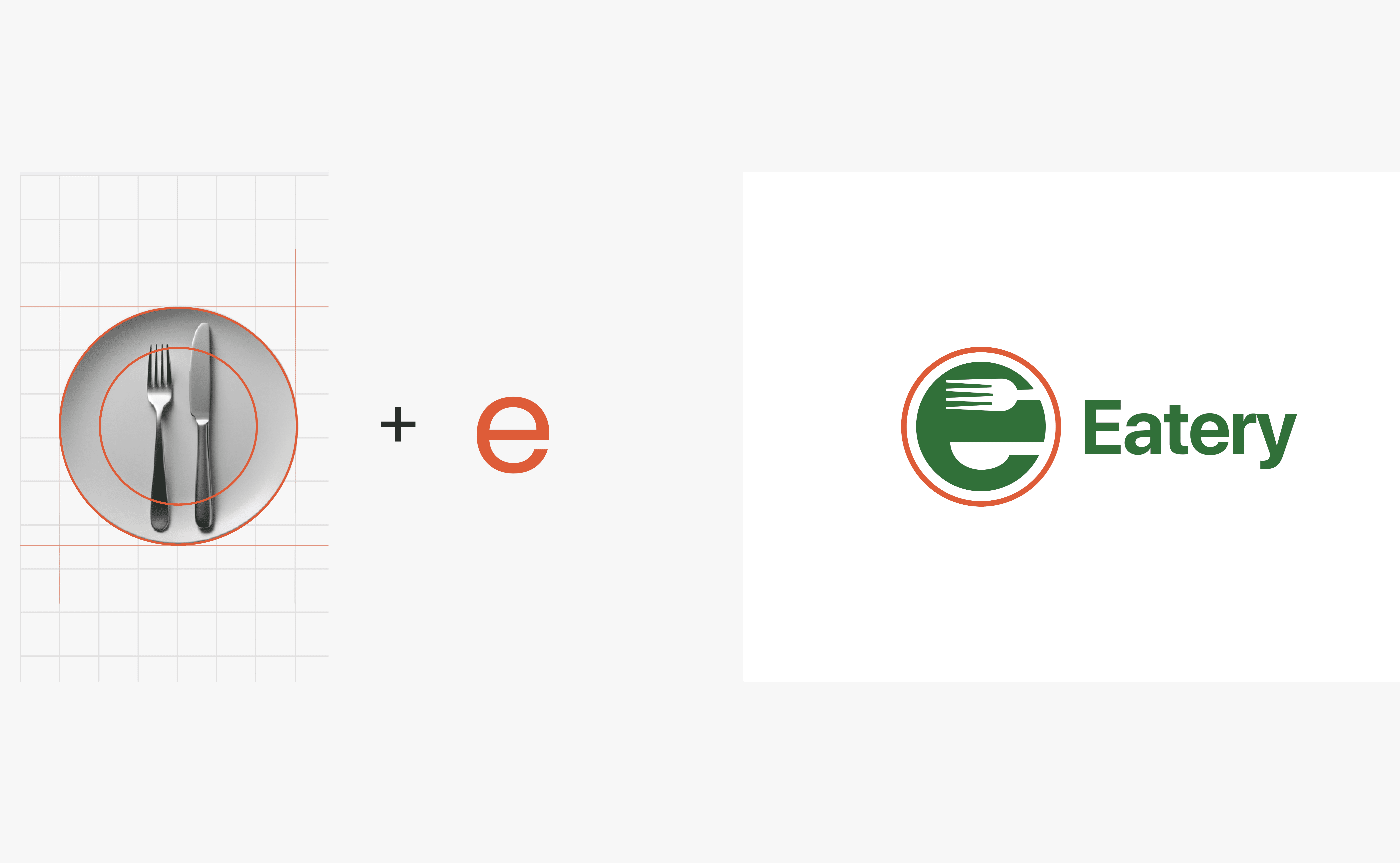
My design approach centred on understanding Eatery’s brand promise: making dining experiences organised, precise, and enjoyable for both restaurants and customers. I explored symbols of precision, connection, and dining, iterating through sketches that merged dining cues with geometric simplicity to create a logo that feels modern and meaningful.
I paired this with a typography study to select a wordmark that aligns with the symbol’s geometric clarity while retaining warmth and approachability.
Solution
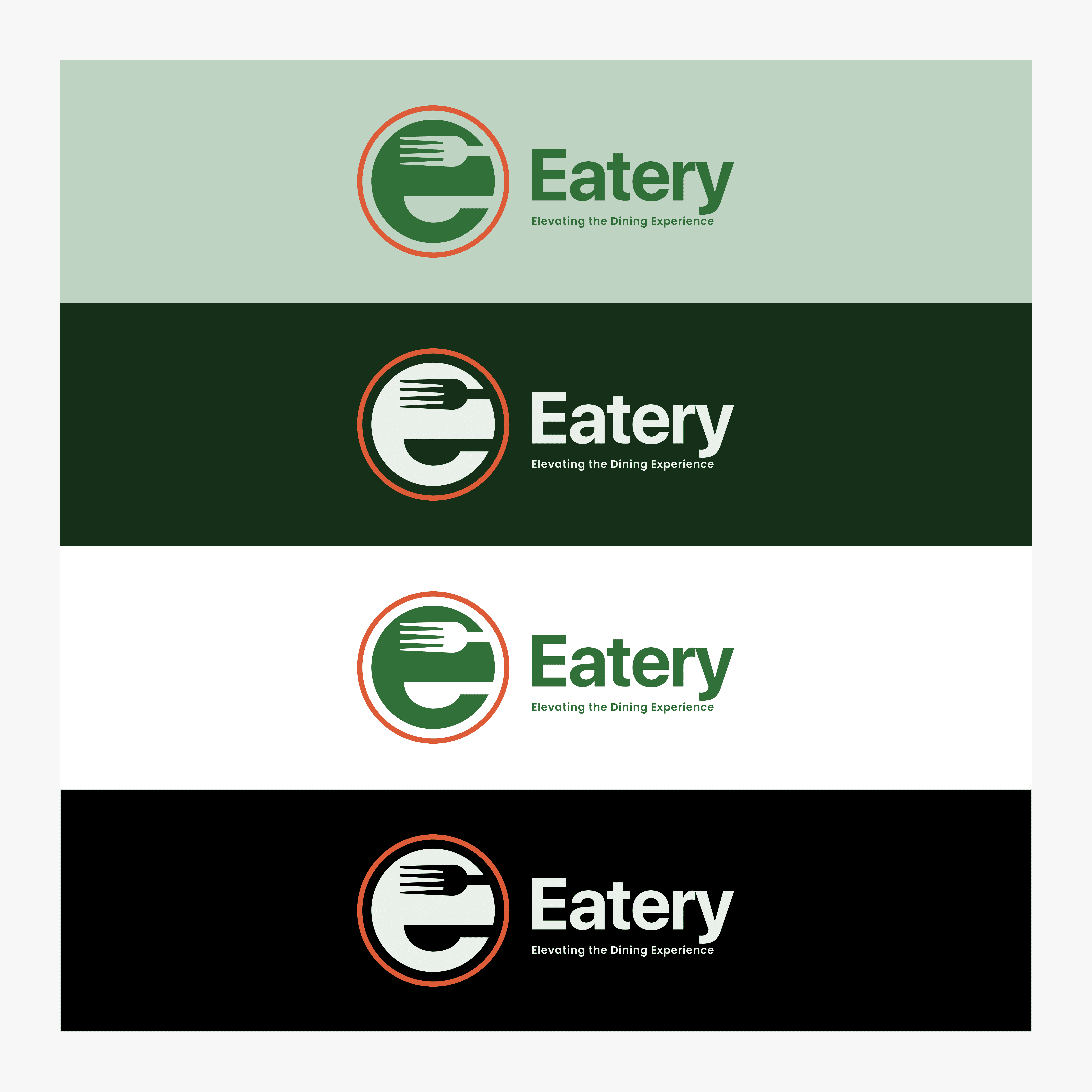
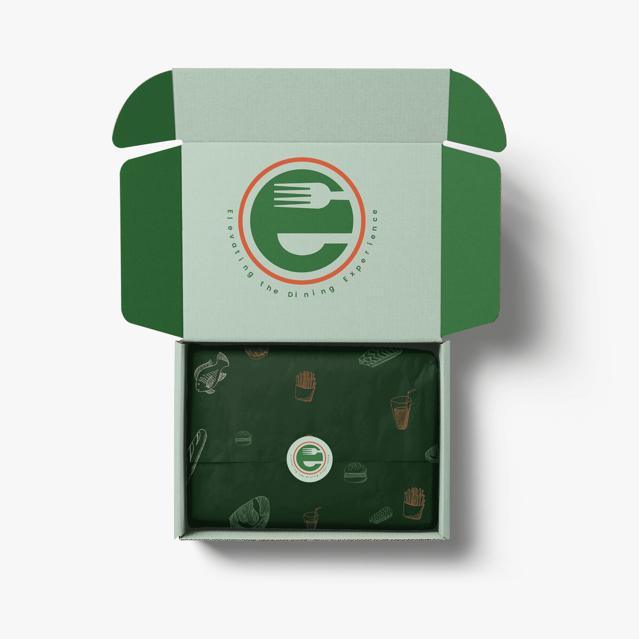
The final Eatery brand identity system combines:
Wordmark:
I selected Poppins as the primary typeface for its clean, geometric design and balanced rounded letterforms. It communicates professionalism, modernity, and warmth while remaining highly legible across screens and print.Symbol:
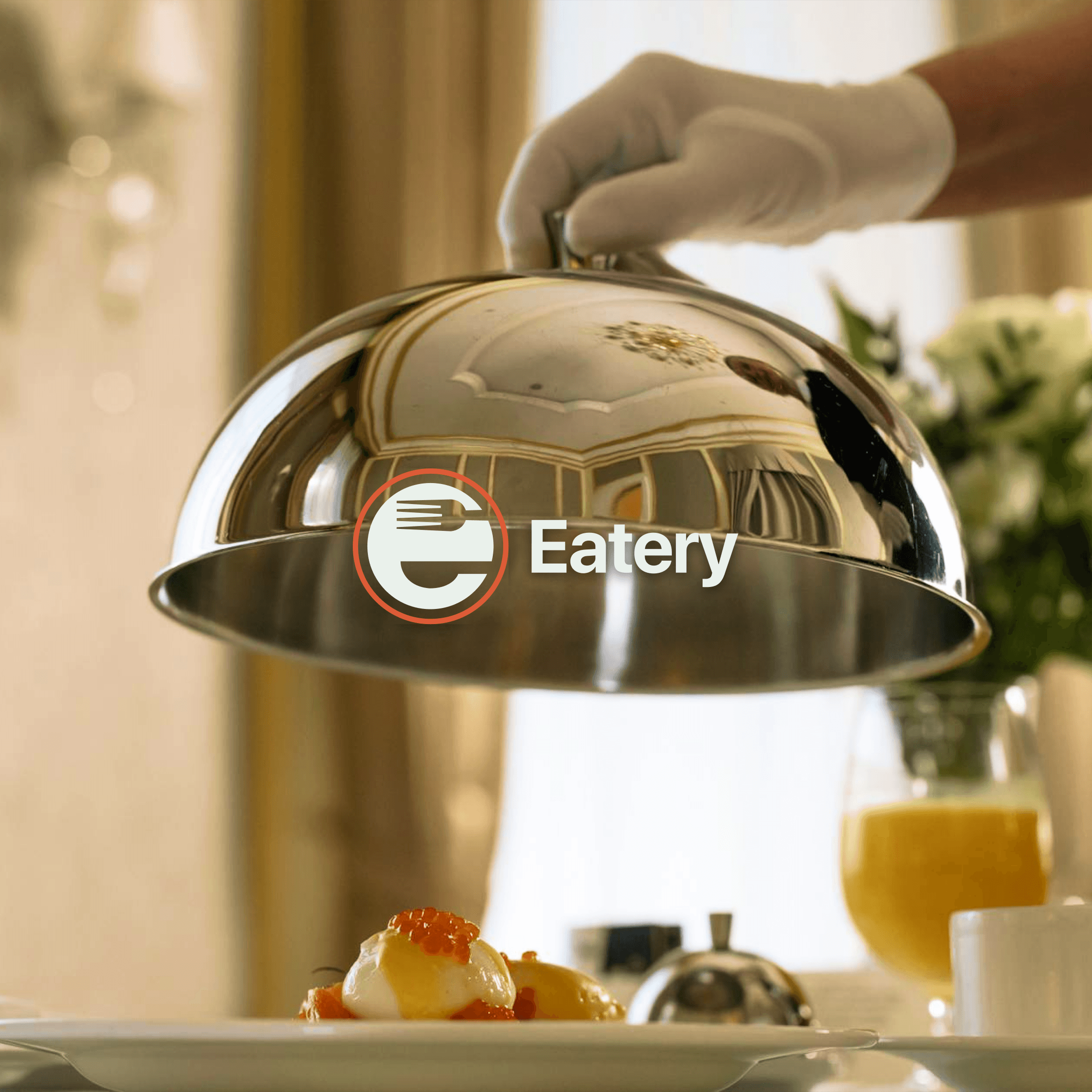
The Eatery symbol integrates multiple meanings within a clean, impactful design.The target-inspired circles represent precision, focus, and efficiency – reflecting Eatery’s role in streamlining restaurant management.
The plate and table concept is conveyed through the circular form, evoking dining without literal food icons.
The stylised “E” formed by negative space between fork and spoon/knife shapes embodies Eatery’s mission to connect people with food and enhance ordering experiences.
The clean concentric lines evoke flow, organisation, and reliability, aligning with Eatery’s position as a tech-driven solution that simplifies operations.
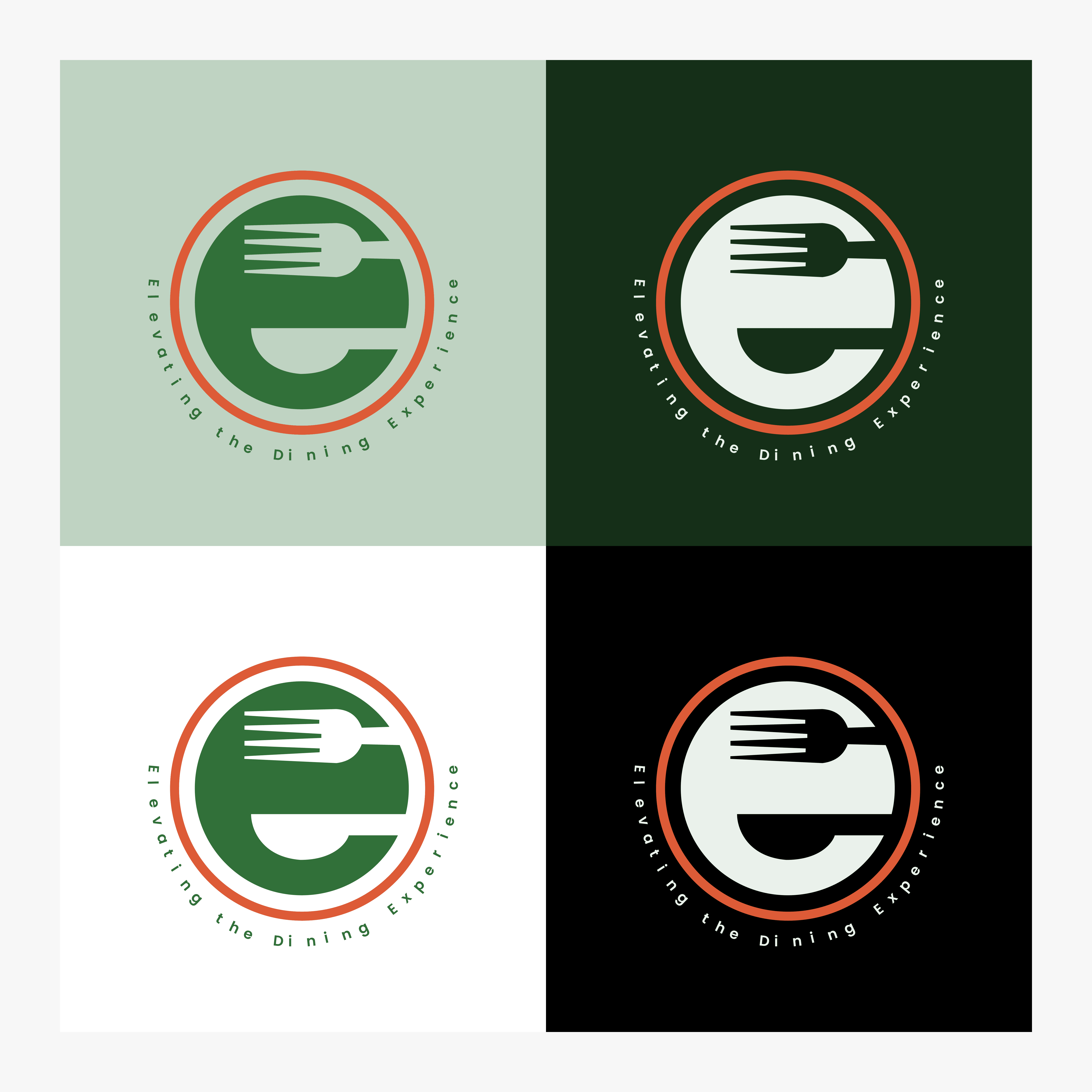
Together, these elements create a modern, versatile, and distinctive identity that feels professional yet warm, functional yet inviting.

Reflection & Learnings
The Eatery brand identity successfully communicates the platform’s precision, connection, and modernity while remaining accessible and memorable. Stakeholders appreciated how the symbol integrates meaning subtly yet clearly, avoiding clichés while staying instantly recognisable.
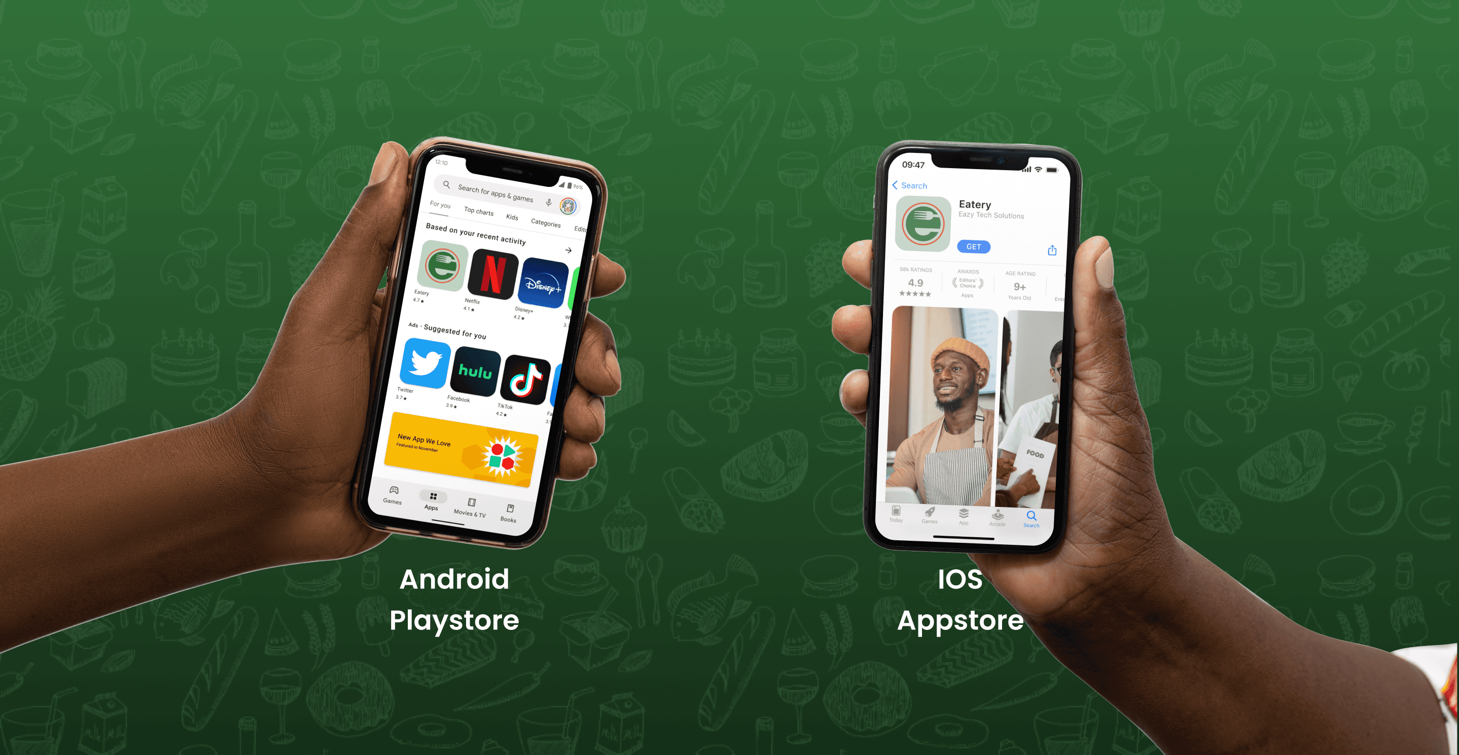
The identity system is now ready for integration across app interfaces, marketing materials, and brand touchpoints, providing Eatery with a visual foundation that strengthens its market positioning and builds user trust through thoughtful design.