
About
Places is a personal branding project I developed to explore the concept of meaningful travel discovery. The idea behind Places is simple: to guide people to hidden gems – unique businesses, cultural spots, and destinations they might only hear about through word of mouth. I envisioned a platform that supports authentic exploration while promoting sustainable, mindful travel experiences that leave lasting memories.

Challenge
As a personal branding project, my main challenge was designing an identity system that communicates trust, adventure, and connection clearly and simply. I wanted the brand to feel approachable and memorable while standing out in the travel and recommendations space, where many brands compete with loud visuals and generic promises.
Creating a brand that feels personal yet universal was essential something that feels like a recommendation from a friend rather than a commercial travel agency.

Design Approach
My design approach started with clarifying the emotional tone of the brand. I aimed for an identity that feels warm, curious, and grounded. I explored visual metaphors around maps, pins, and personal discovery, seeking a mark that could represent both the name and the brand’s purpose with simplicity and elegance.
I also focused on choosing colours and typography that evoke feelings of exploration, nature, and trust while remaining versatile for digital and print applications.

The Solution
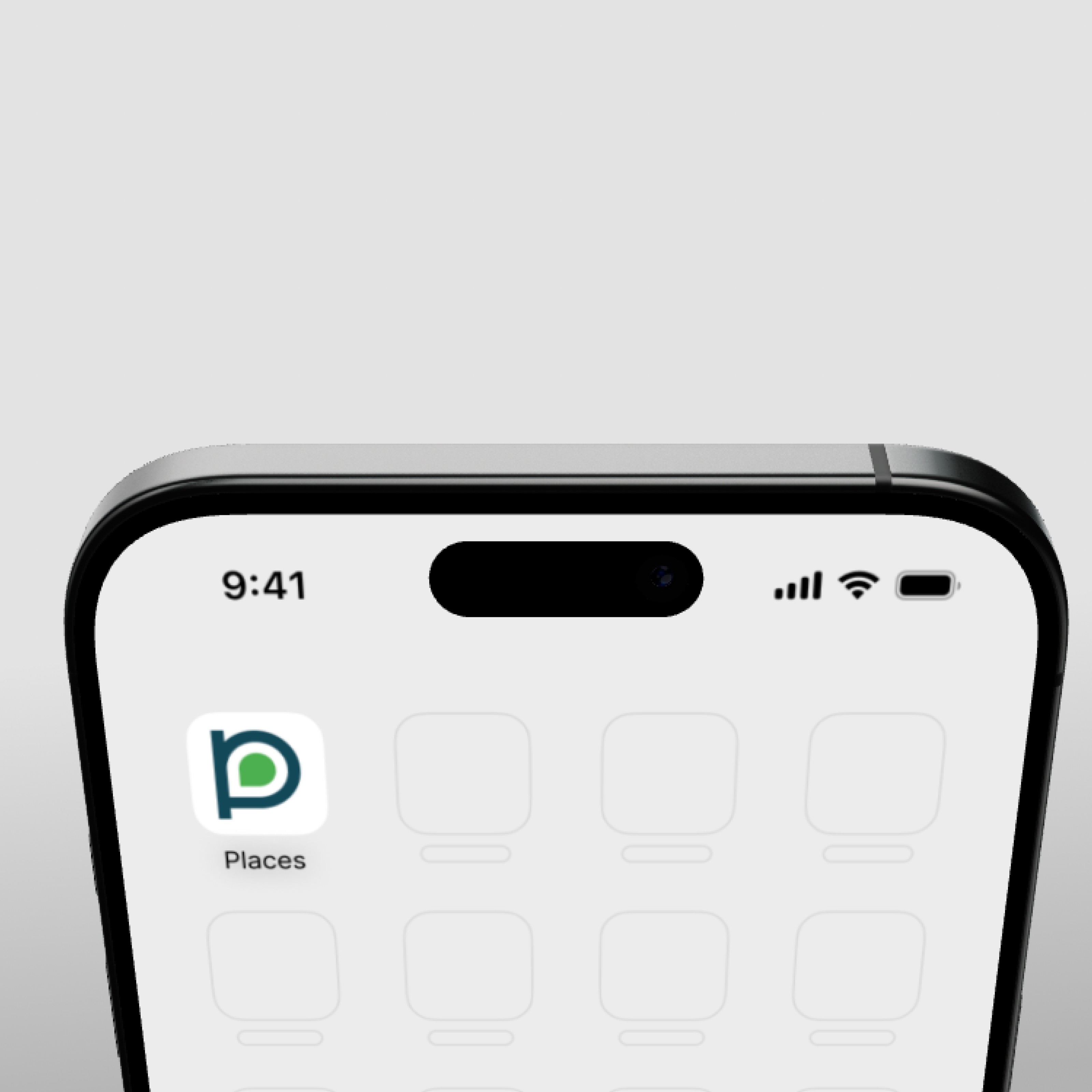
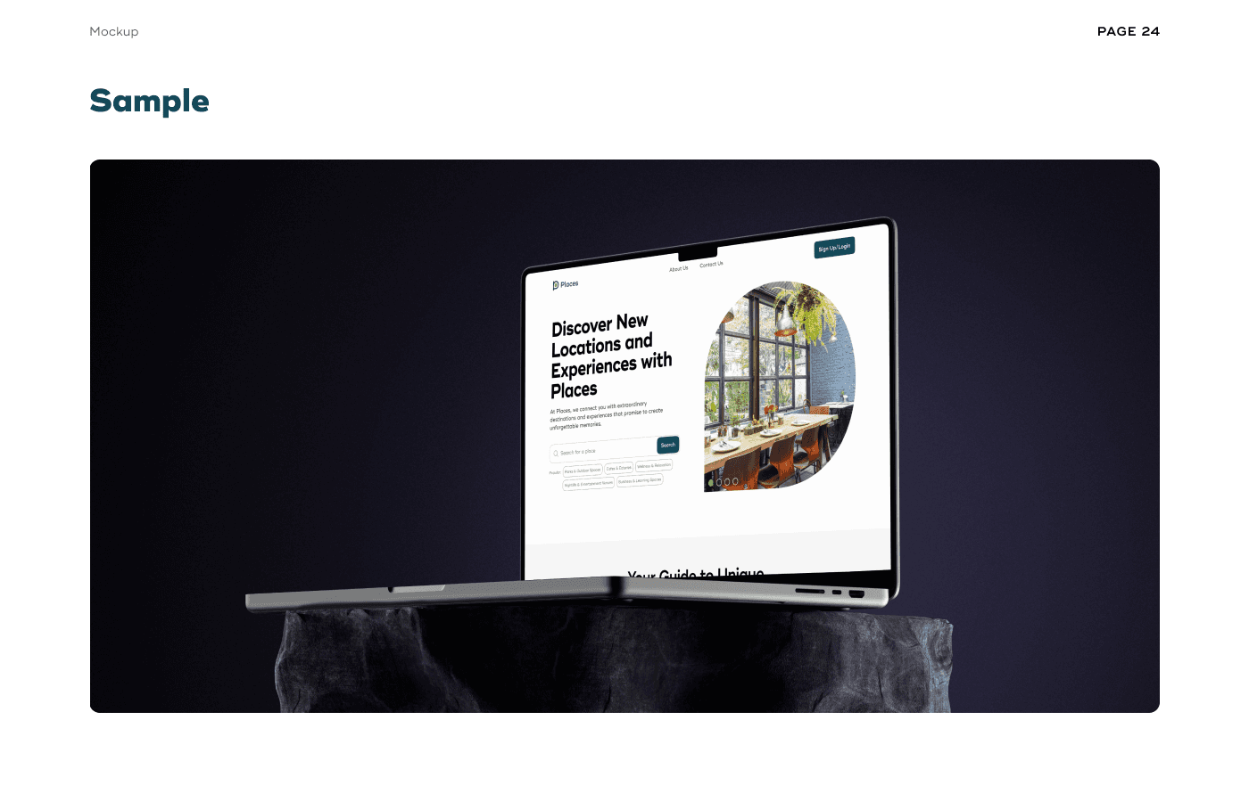
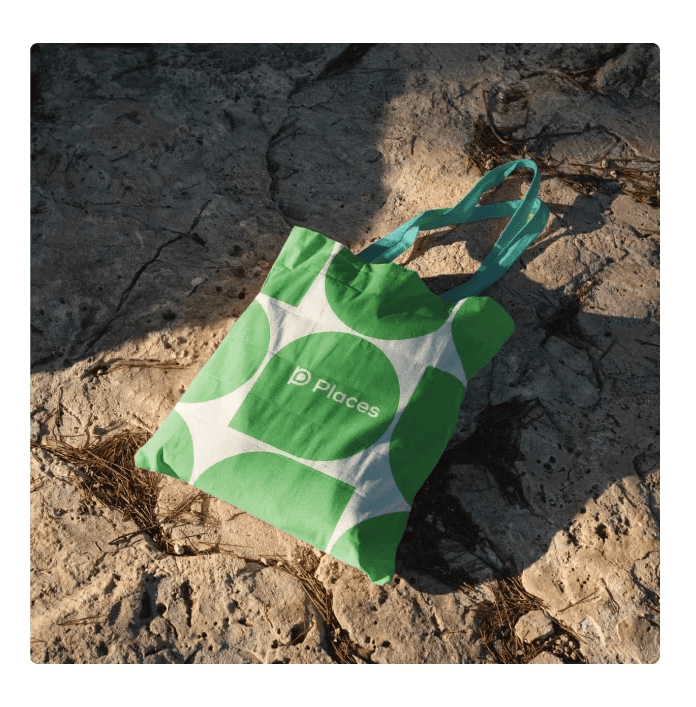
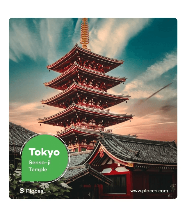
The final identity system centred around a distinctive logomark combining a lowercase “p” with a map pin symbol. This combination encapsulates both the brand name and its mission to guide people to special places.
For the colour palette, I selected Ocean Blue and Nature Green as primaries to reflect freshness and adventure, supported by Sunset Orange for warmth, Midnight Black for depth, and Pure White for clarity and balance.
Typography was equally important. I chose Ridley Grotesk, a modern serif with friendly curves that conveys warmth and curiosity while maintaining readability across brand touchpoints.
To bring the concept to life, I designed:
The primary logo and its variations
Logomark configurations
Mobile app icon adaptations
Colour application rules
Typography usage samples
Brand mockups for digital interfaces and stationery
This created a cohesive system that feels distinctive, adaptable, and true to the brand’s purpose.

Reflection & Learnings
The final brand identity feels clean, warm, and memorable, successfully communicating Places’ core idea of discovery and personal connection. This project allowed me to refine my branding process further, from concept development to detailed visual execution, while deepening my understanding of how to build systems that translate emotions into functional design.
